Camp Winston
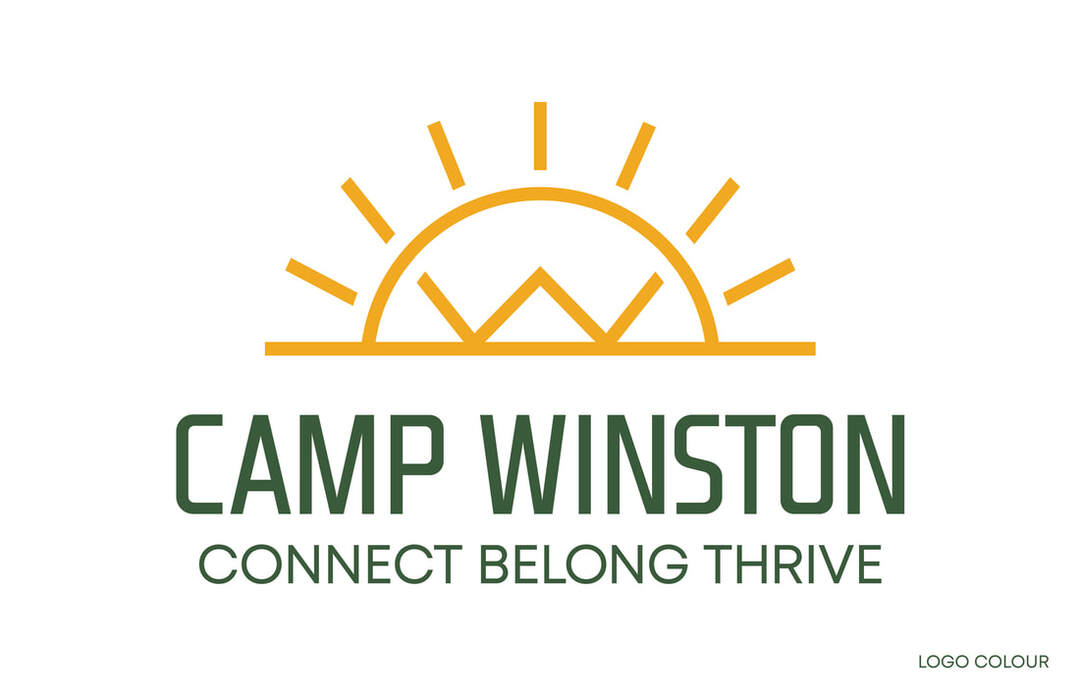
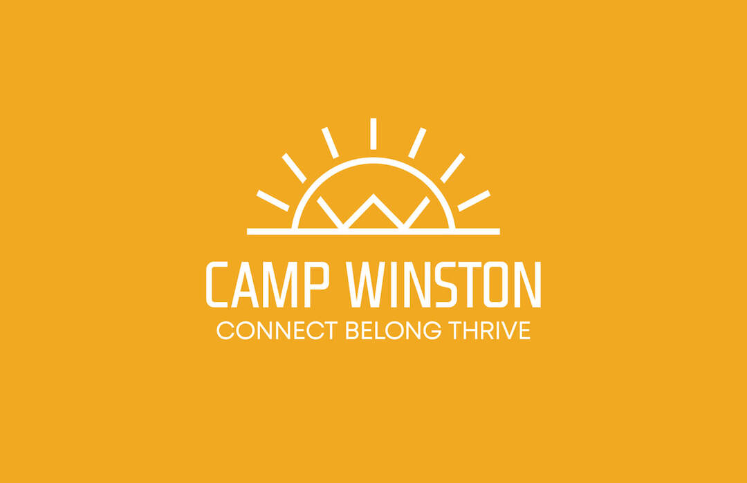
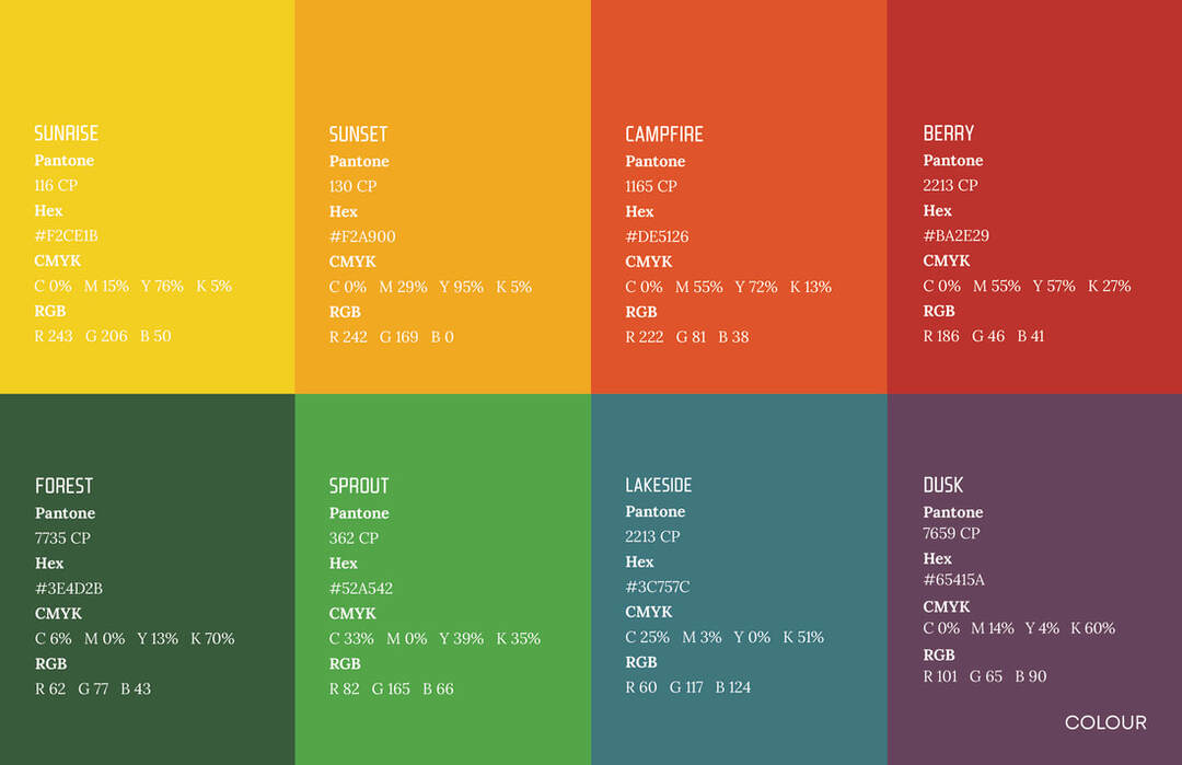
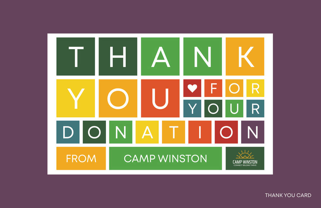
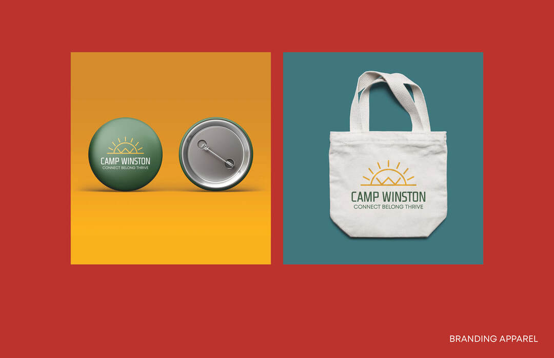
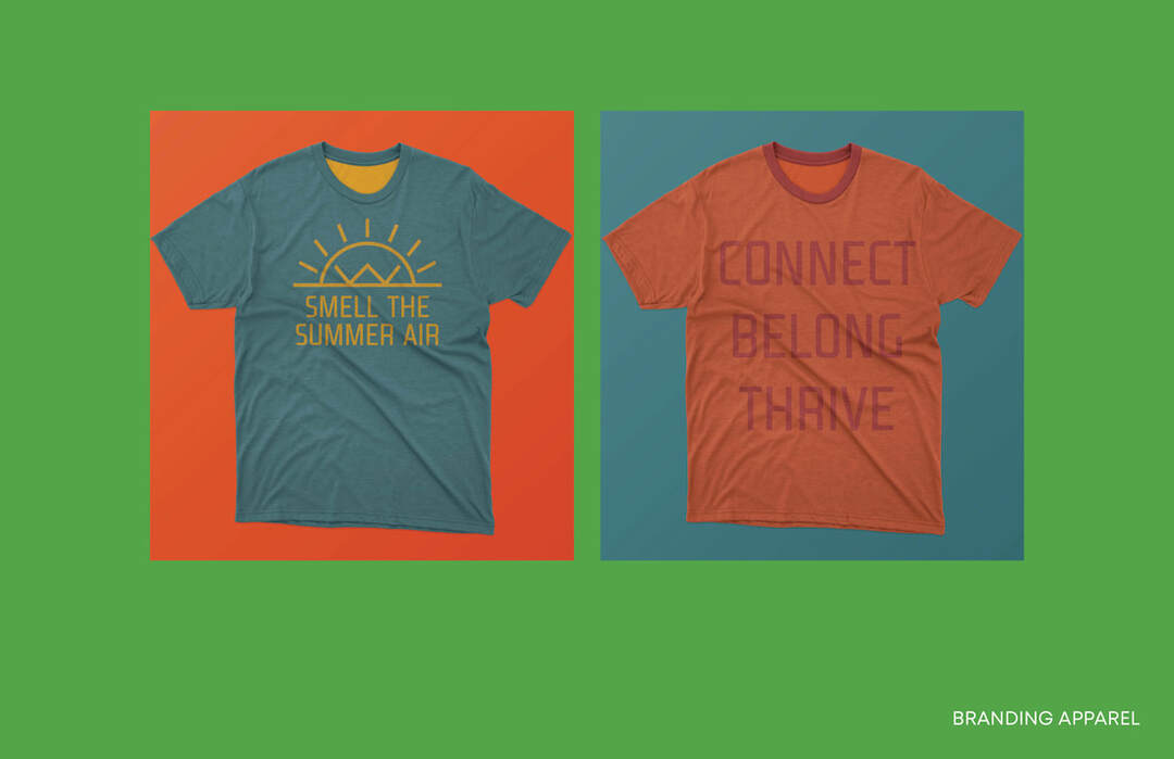
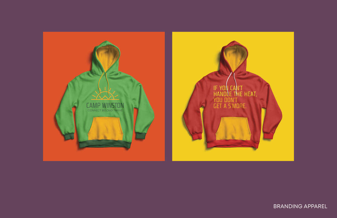
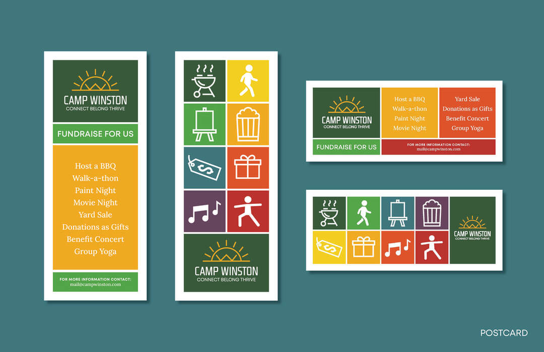
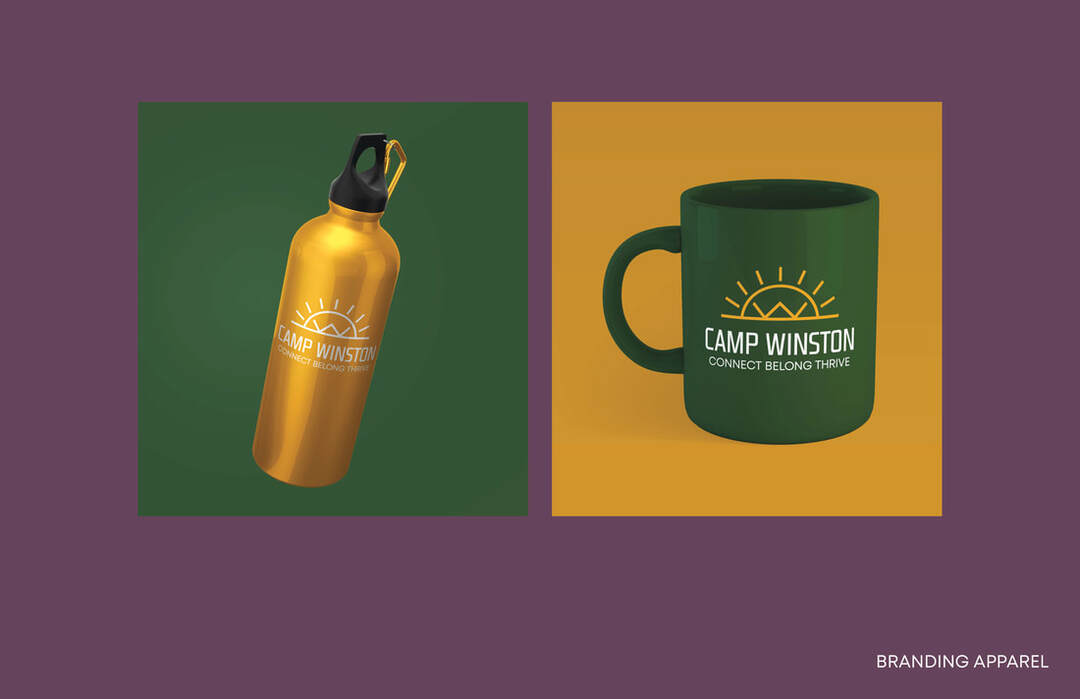
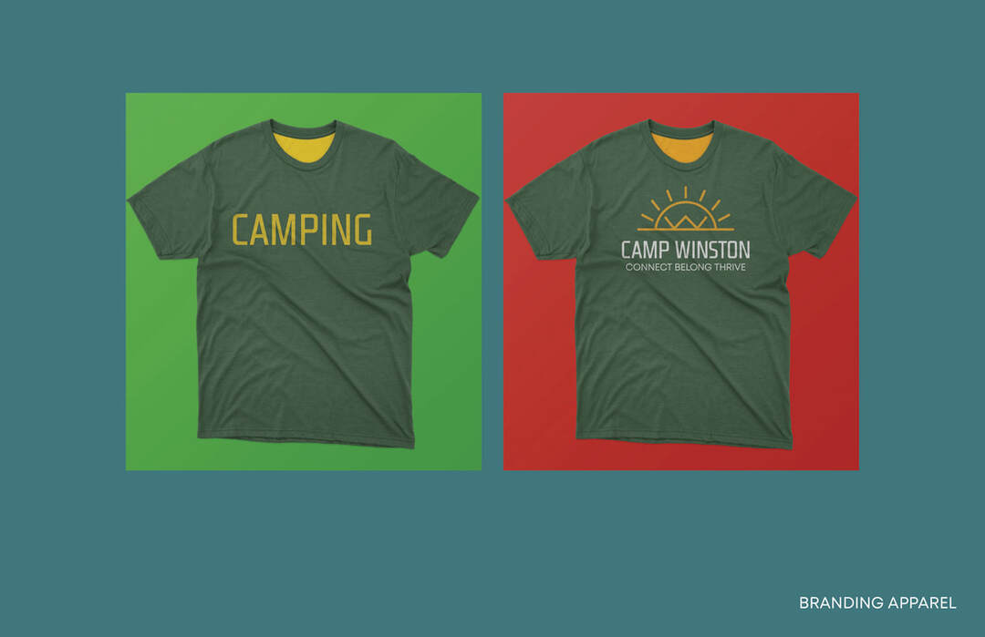
The main imagery of this logo is a sun. This sun shows the warmth that Camp Winston provides. This sun was designed using the letter “W” at its centre. This was done so that the logo itself can be identified with and without the type. We stuck closely to Camp Winstons existing colour to avoid confusion when transitioning to the new logo.
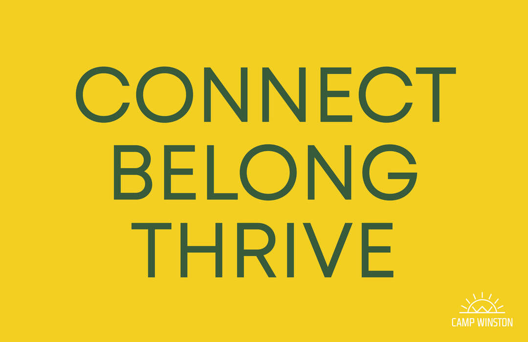
The combination of the simple design and recognizable colours makes this logo enjoyable for campers, caregivers, and donors alike. We created the tagline with Camp Winston’s values in mind and how the campers are helped. Camp Winston provides a safe space where neurodiverse youth can make friends and participate in activities without fear of judgement. Being a part Camp Winston is a journey that allows campers to lead more successful lives, and it relieves some stress for the caregivers.
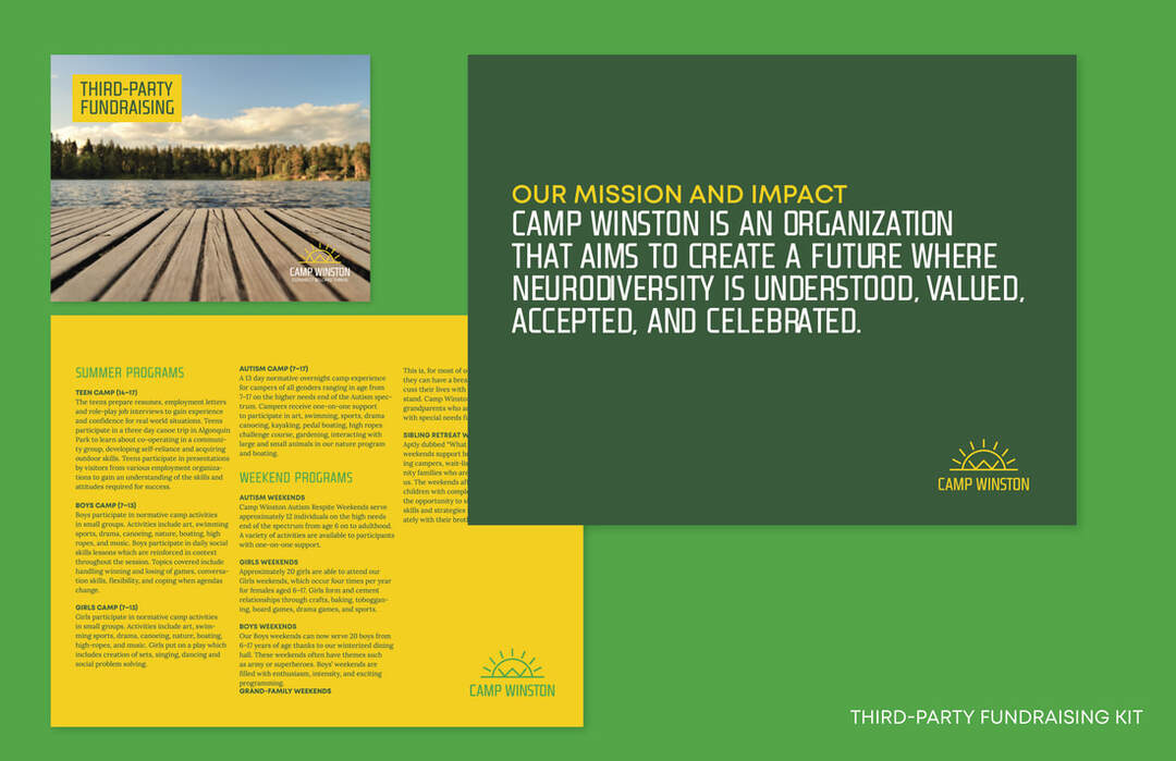
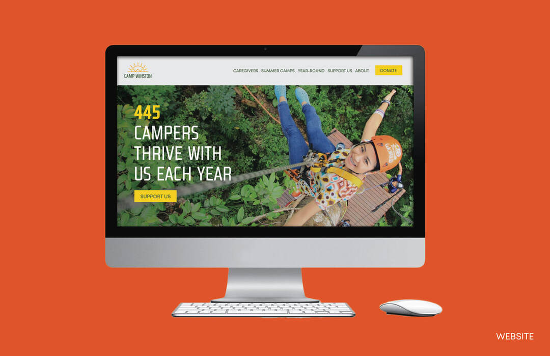
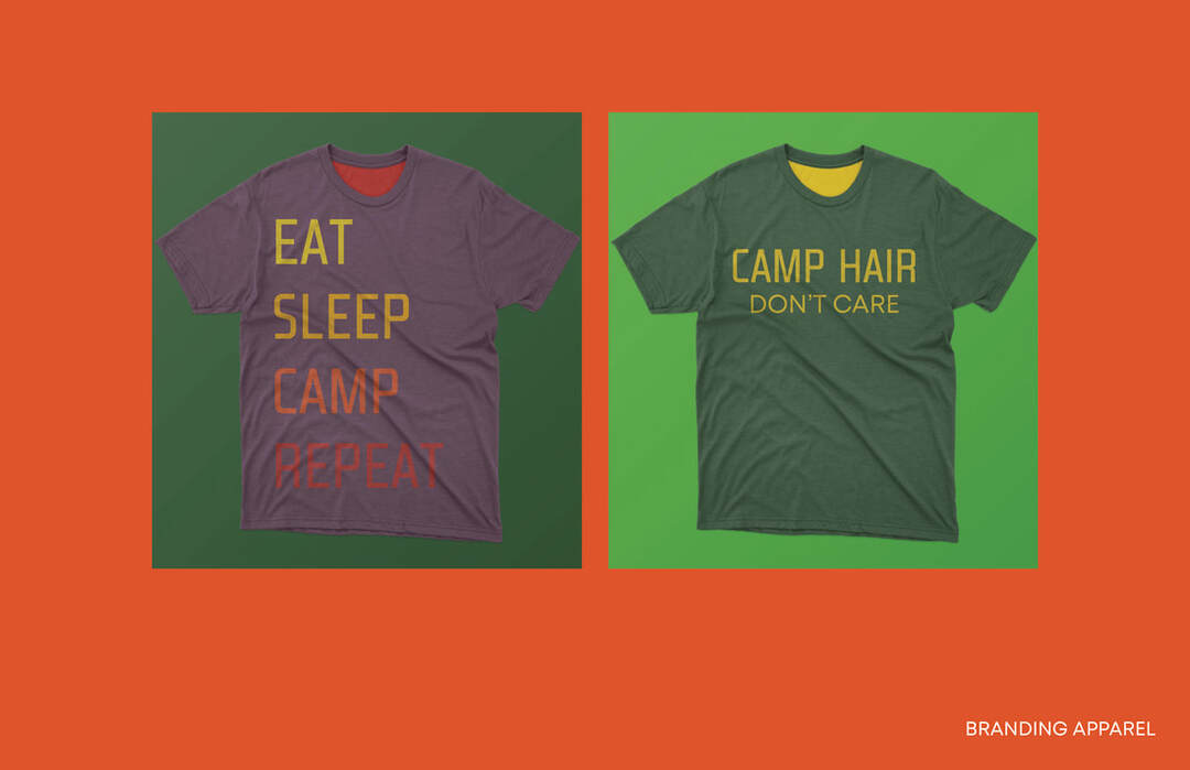
Branding, Merchandise, Website, Layout
The project created as a partnership with students Tiffney Latendresse, Kris Zukowski, Chris Brown and Rebecca Grove
